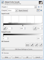
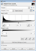
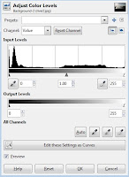
A histogram is a statistical tool used to display the distribution of a range of data. An image histogram displays the tonal range of the individual pixels that comprise the image. Each pixel is given a value ranging from 0 to 255 depending on its tone (brightness). A value of 0 corresponds with black, 255 with white and 128 is a mid-tone in between those two values.
Why 0 to 255?
That is the amount of information that can be stored in a single byte of information. A byte is eight bits. A bit can hold two numbers: 0 or 1 (or two pieces of information.) Adding a bit allows you to double the amount of information that can be held. Eight bits is 28 (or 2 doubled eight times) of information that can be stored. In numerical terms, that is 256 different combinations possible. 0 to 255 equals 256 different numbers.
Color Channels
The software used to edit digital images will also display a histogram for the image's color channels: red, green and blue.
This has to do with the way images are displayed on a computer screen. Each of the screen's pixels produces actually produces those three colors of light in varying strengths. The color perceived by the human eye depends on the amount of each color produced. A byte of information is dedicated to each color. So the range of values for each color again ranges from 0 to 255.
Combining the 256 combinations for each color results in 16,777,216 potential combinations. This is the number of colors the modern computer monitor is capable of displaying.
What Histograms are Good For
All this means that histograms provide important information about the tonal range of an image. This includes vital information of the tonal range of each color channel as well as the image's overall range. This information can prove very useful when it comes to editing the image. The histogram can even be directly edited. (This is usually referred to as editing an image's levels. Look for your software's level editing options to alter the histogram.)
Many digital camera include an option to view the histogram for an image before you actually hit the shutter release. This immediate feedback can help at times. A histogram that is pushed against either side indicates that exposure adjustment may be in order.
The rest of this post is dedicated to providing histogram examples and the conclusions that can be reached by examining them. Editing histograms will be covered in a future post.
Example #1 (Peak at 255 Mark)
Any attempt to increase the contrast in this image needs to be done carefully. Increasing contrast in this case runs the risk of pushing the non-white pixels in the flowers into being white, losing definition in the flowers.
There is also very little room to extend contrast on the dark end for this image. While there is no actual black, there is a small peak just shy of that value. Increasing contrast could also lose details in the dark areas of this image.
A peak at the 255 mark is often associated with overexposure. This does not necessarily require the entire photo to be overexposed. It may be a portion of the image that is overexposed (the flowers above fall in that category). Digital camera aren't always capable of covering the entire range of values present when a photo is taken. This results in either the bright areas being overexposed or the dark areas being underexposed.
Example #2 (Overexposed Image)

The light areas in this image have basically lost all details, also referred to as blown out highlights. The information needed to render these areas as anything other than a single color has been lost unless the camera saved the image in RAW format. Saved in any other format the image is a lost cause. (RAW files save more than 8 bytes of information per pixel, but only 8 bytes can be used when the image is displayed or exported in another format.)
A flat histogram with only a single peak at the far right is probably a badly overexposed image, but there are properly exposed images that would have similar histograms. This is why you can never really tell whether an image is overexposed, underexposed or properly exposed without actually looking at the image.
Example #3 (Deep Shadows, Bright Highlights)

Some hard work could transform this image into one that is far more visually appealing. The standard tools may not be adequate when trying to save this type of image, though. (Editing levels as curves my work, but that is far more complicated than other editing methods.)
This one isn't a complete lost cause, but may not be worth the effort it would take to save.
Again, a perfectly usable image could produce a similar histogram. (Think black car with tinted windows and a few chrome highlights.)
Example #4 (Peak at 0)

The lower right part of the image contains no usable information and is just solid black. This image is similar to the first example in that the underexposure is due to the value range being more than the camera could handle. The result is a portion of the image being underexposed instead of the entire image.
These types of images may still be usable, but the over or under exposed areas need to be considered when editing.
I don't have an example of an underexposed image . The histogram would look similar to the overexposed image in example #2, but reversed with the peak on the left side.
The histogram for every image is going to be as unique as that image. The ones above are just meant to give brief illustration about the type of histograms that might be encountered and what to be on the look out for.


No comments:
Post a Comment