Hat Tip: Beta News
Version 4.0 of the free Paint.net image editing software has (finally) been released.
The previous stable version (3.5) was released in 2008. The latest version requires Windows 7 or better to run. (3.5 can still be downloaded for Vista or XP users.) Dual-core or better hardware is recommended.
Version 4 introduces some new features and upgrades many carried over from the previous edition.
Showing posts with label image editing. Show all posts
Showing posts with label image editing. Show all posts
Wednesday, June 25, 2014

Monday, June 23, 2014
Fine Art America Update
It's been a very slow news day (again).
Weekends and Mondays tend to be slow news days and those are the days I tend to go through the photos I've taken that week. It's also when I catch up on uploading images.
I thought I'd share my latest upload to Fine Art America.

It's a shot I took while visiting a bicycle trail near my home. (It's not quite within walking distance.)
The trail used to branch off into the area where the bench is located. It's no longer maintained by the parks department.
I used a lomo filter on the image. The original had blown-out highlights in the background and the lomo filter helped tone those down.
Weekends and Mondays tend to be slow news days and those are the days I tend to go through the photos I've taken that week. It's also when I catch up on uploading images.
I thought I'd share my latest upload to Fine Art America.
It's a shot I took while visiting a bicycle trail near my home. (It's not quite within walking distance.)
The trail used to branch off into the area where the bench is located. It's no longer maintained by the parks department.
I used a lomo filter on the image. The original had blown-out highlights in the background and the lomo filter helped tone those down.
Thursday, May 22, 2014
Photoshop CC to Work With Touchscreen Technology
Hat Tip: Pop Photo
Adobe is working on making Photoshop compatible with touchscreen technology. This would enable using tablets and similar devices to be used to edit photos without having to use an additional keyboard or mouse. Photos could be edited on site. This could greatly benefit photographers that shoot on location instead of in a studio.
The edited photos could be sent to an editor or client while still on location as long as the device had communications capabilities.
This also has implications for in studio editing. Many of the current computer display options include touchscreen capabilities. These displays could conceivably replace art tablets. The touchscreen display could be used exactly like an art canvas. (How viable this options turns out to be is anybody's guess at this time.)
Personally, I have mixed feelings about Adobe. I'm not a fan of the Cloud Computing subscription model. The latest Abode server issue illustrates why.
At the same time, the arguably produces the best image editing software currently available. Photoshop is usually the first program to offer new features. Other companies then have to find a way to include similar features in their products.
It will be interesting to see how long it takes those other companies to offer this feature as well.
Adobe is working on making Photoshop compatible with touchscreen technology. This would enable using tablets and similar devices to be used to edit photos without having to use an additional keyboard or mouse. Photos could be edited on site. This could greatly benefit photographers that shoot on location instead of in a studio.
The edited photos could be sent to an editor or client while still on location as long as the device had communications capabilities.
This also has implications for in studio editing. Many of the current computer display options include touchscreen capabilities. These displays could conceivably replace art tablets. The touchscreen display could be used exactly like an art canvas. (How viable this options turns out to be is anybody's guess at this time.)
Personally, I have mixed feelings about Adobe. I'm not a fan of the Cloud Computing subscription model. The latest Abode server issue illustrates why.
At the same time, the arguably produces the best image editing software currently available. Photoshop is usually the first program to offer new features. Other companies then have to find a way to include similar features in their products.
It will be interesting to see how long it takes those other companies to offer this feature as well.
Friday, May 16, 2014
One Thing That Makes Me Glad That I Can't Afford Photoshop
I am forced to operate on a tight budget due to limited finances. Among other things, that means no Adobe Photoshop or other expensive image editing software.
Turns out there's a huge drawback with Photoshop.
If Adobe's servers go out, you can't use your applications. A brief interruption is one thing, but the server problem has lasted nearly 24 hours. Some photographers can get around the problem by using applications offline in "trial mode."
Unfortunately, this doesn't work for everyone. Some photographers have found that their applications won't go into trial mode. The application is set so that the "Trail Period" has expired. The only way to fix this is to log into Adobe's server. You know. The one that is currently down.
Adobe already antagonized photographers by moving to the Crowd Computing model. Now it has just reinforced the idea that its CC business model is a bad idea for its customers.
I suspect that many current Photoshop users are going to start looking for viable alternatives. This is especially true for professional photographers whose livelihood depend on reliable image editing software. One that becomes unusable for 24 hours because the software company's servers go down doesn't fit that need.
Turns out there's a huge drawback with Photoshop.
If Adobe's servers go out, you can't use your applications. A brief interruption is one thing, but the server problem has lasted nearly 24 hours. Some photographers can get around the problem by using applications offline in "trial mode."
Unfortunately, this doesn't work for everyone. Some photographers have found that their applications won't go into trial mode. The application is set so that the "Trail Period" has expired. The only way to fix this is to log into Adobe's server. You know. The one that is currently down.
Adobe already antagonized photographers by moving to the Crowd Computing model. Now it has just reinforced the idea that its CC business model is a bad idea for its customers.
I suspect that many current Photoshop users are going to start looking for viable alternatives. This is especially true for professional photographers whose livelihood depend on reliable image editing software. One that becomes unusable for 24 hours because the software company's servers go down doesn't fit that need.
Thursday, May 15, 2014
Zoner Photo Studio Promotion: Free Download
Hat Tip: Peta Pixel
CNet is cooperating with the creators of Zoner Photo Studio, making the 15 Pro version of the software free to download for a very short period of time.
Zoner Photo Studio is an Adobe Lightroom alternative and normally carries a $90 price tag.
The promo is for the 15 Pro version of the software. The idea is to get people interested in the software in the hopes that people will upgrade to version 16. (And to get people that like version 15 to spread the word about the program so that those that missed the promotion will buy the product.)
The price to upgrade from version 15 to version 16 is currently $35. The free download makes the latest, paid version, more affordable as well.
CNet is cooperating with the creators of Zoner Photo Studio, making the 15 Pro version of the software free to download for a very short period of time.
Zoner Photo Studio is an Adobe Lightroom alternative and normally carries a $90 price tag.
The promo is for the 15 Pro version of the software. The idea is to get people interested in the software in the hopes that people will upgrade to version 16. (And to get people that like version 15 to spread the word about the program so that those that missed the promotion will buy the product.)
The price to upgrade from version 15 to version 16 is currently $35. The free download makes the latest, paid version, more affordable as well.
Saturday, April 19, 2014
Federal Truth in Advertising Law Proposal: The Ultimate Photoshop Failure
Posting articles analyzing Photoshop failures has become a common practice for web sites that have anything remotely to do with photography. This includes sites dedicated to social commentary, fashion, celebrities as well as photography sites.
Well, the folks over at SLR Lounge and DIY Photography have articles on what may be the ultimate Photoshop failure.
Ileana Ros-Lehtinen (R-FL) and Lois Capps (D-CA) have introduced the Truth in Advertising Act (H.R. 4341) that would address Photoshop use in advertising.
There aren't any regulations proposed at this point. The Act directs the Commerce Department to "study" the impact of Photoshop in advertising. (The Act specifically mentions Photoshopping models and the impact it has on "body image.")
I'll put it bluntly, this is nothing more than the Congress asking for a study to justify regulating the use of Photoshop in advertisement. Why ask for the study if you're not prepared to act on it?
The worst part is that the justification given for the study applies to other advertising sectors. Obesity epidemic? Let's go after Photoshopping in food advertisements.
Do these Congresswomen not understand the can of worms they are opening here?
Let's decide for the sake of argument that Congress decides something has to be done about Photoshopping advertisements. What do they do?
Who gets to decide what is allowed? How do you implement limitations? Who enforces regulations? (And how many new federal employees would it take?) Do you limited rules to just Photoshopping people in advertisements? (I can hear Michelle Obama already calling for regulating food ads.)
Most importantly, how do you justify Government involvement given that the Supreme Court has already ruled that advertisements amount to Constitutionally protected Free Speech?
We have a $17 Trillion National Debt, one we add nearly $1 Trillion to every year. We have little economic growth. Food prices (especially beef, pork and shrimp) are going up dramatically. We have Putin destabilizing Eastern Europe.
And these two nitwits decide the most pressing issue that needs addressing is the use of Photoshop in advertising.
Is there any doubt as to why there is little respect for the people running Washington right now?
Well, the folks over at SLR Lounge and DIY Photography have articles on what may be the ultimate Photoshop failure.
Ileana Ros-Lehtinen (R-FL) and Lois Capps (D-CA) have introduced the Truth in Advertising Act (H.R. 4341) that would address Photoshop use in advertising.
There aren't any regulations proposed at this point. The Act directs the Commerce Department to "study" the impact of Photoshop in advertising. (The Act specifically mentions Photoshopping models and the impact it has on "body image.")
I'll put it bluntly, this is nothing more than the Congress asking for a study to justify regulating the use of Photoshop in advertisement. Why ask for the study if you're not prepared to act on it?
The worst part is that the justification given for the study applies to other advertising sectors. Obesity epidemic? Let's go after Photoshopping in food advertisements.
Do these Congresswomen not understand the can of worms they are opening here?
Let's decide for the sake of argument that Congress decides something has to be done about Photoshopping advertisements. What do they do?
Who gets to decide what is allowed? How do you implement limitations? Who enforces regulations? (And how many new federal employees would it take?) Do you limited rules to just Photoshopping people in advertisements? (I can hear Michelle Obama already calling for regulating food ads.)
Most importantly, how do you justify Government involvement given that the Supreme Court has already ruled that advertisements amount to Constitutionally protected Free Speech?
We have a $17 Trillion National Debt, one we add nearly $1 Trillion to every year. We have little economic growth. Food prices (especially beef, pork and shrimp) are going up dramatically. We have Putin destabilizing Eastern Europe.
And these two nitwits decide the most pressing issue that needs addressing is the use of Photoshop in advertising.
Is there any doubt as to why there is little respect for the people running Washington right now?
Sunday, November 10, 2013
Determining How Your Photographs Will Look on a Phone Case
I recently wrote a post suggesting phone cases as Christmas gifts. My Fine Art America account allows me to offer my photographs for use on phone cases. One of the problems I have had is determining how those photos would actually look when used.
I recently created an account on RedBubble. It offers a wider range of products than Fine Art America. (I am planning on creating accounts on Zazzle and CafePress as well). RedBubble offers a template for use with iPhone and iPad cases.
This template does give a better idea as to how the final product will look, but it still isn't perfect. I decided to create a template that works better when trying to determine how an image will look on an iPhone case (based on the RedBubble template).

The white area is actually transparent. This allows the underlying image to show through in that area. The gray is set to 50% transparency. This area corresponds to the sides of the case. This portion of the image will be printed on the case, but not visible when only the front can be seen.
The black area represents an area not printed when using RedBubble. It's there so that the image can still be used if the case design changes.
Here's how the template looks over an actual image:

The template was placed over the image for best results then cropped to the template size. This looks like it should work well for a phone case. The main subject is completely on the front of the case and fairly well located.
I recently created an account on RedBubble. It offers a wider range of products than Fine Art America. (I am planning on creating accounts on Zazzle and CafePress as well). RedBubble offers a template for use with iPhone and iPad cases.
This template does give a better idea as to how the final product will look, but it still isn't perfect. I decided to create a template that works better when trying to determine how an image will look on an iPhone case (based on the RedBubble template).

The white area is actually transparent. This allows the underlying image to show through in that area. The gray is set to 50% transparency. This area corresponds to the sides of the case. This portion of the image will be printed on the case, but not visible when only the front can be seen.
The black area represents an area not printed when using RedBubble. It's there so that the image can still be used if the case design changes.
Here's how the template looks over an actual image:

The template was placed over the image for best results then cropped to the template size. This looks like it should work well for a phone case. The main subject is completely on the front of the case and fairly well located.
Friday, October 25, 2013
Repairing Blown-Out Highlights with Inpaint
Inpainting refers to repairing or reconstructing portions of an image. That area may have been damaged in some way or the image may include unwanted content. Modern image editing software often offer options to automatically repair these sorts of image defects by using an Inpaint plug-in or filter.
Example of Inpaint
I use GIMP when editing images. It's free to use and offers a large array of image editing options. Inpaint is not included as part of the basic program, but can be added through plug-ins. The G'MIC plug-in offers over 500 additional filters, including three different inpaint options. I will be using one of these filters in this example. (Inpaint filters are similar enough that the example will help illustrate how Inpaint filters work independent of program.)
Here's the starting image chosen for this example. It's a shot of a mushroom growing in a pile of old leaves in my yard. There is a large area with blown-out highlights at the top of the image and the image could be drastically improved by eliminating that patch.

Note: blown-out highlights are not the only areas that can be repaired by Inpaint. It just happens to be the reason for using it with the above image. Also, Inpaint is not the only method available for addressing these sorts of image problems.
The example here will use the G'MIC patch-based Inpaint filter. G'MIC also offers solidify and diffusion based filters. I found the diffusion Inpaint filter to be far too time consuming to actually use and the patch-based filter produced far better results than solidify.
Using the Filter
Step 1. Define the Area
This tells the software what portion of the image should be effected by the Inpaint filter. The G'MIC plug-in for GIMP offers three methods of defining the area to be effected.
One method applies Inpaint to transparent areas. For this type of filter, simply erase the area to be affected. (Make sure the image has an alpha channel first if not enabled by default.)
The second applies the filter to a particular color. The area affected needs to be replaced with that color. The actual method used is not important, but it must involve no feathering. Feathering will result in part of the color being left behind after the filter is applied.
The third method uses a second transparent layer. The area to be affected is painted in. The filter then applies the effect to the areas under the opaque portion of this layer. The color used for marking the area is not important. It just needs to be opaque.
Other programs may utilize a different method for marking the area for the filter.
Applying the "mask" for the filter.
 Here the area has been marked using red by using GIMP's pencil tool set to 100% hardness to avoid feathering.
Step 2. Run the Filter
In GIMP, the G'MIC plug-in filters are accessed by selecting filters on the top menu bar and then scrolling down to the bottom of the filters list. G'MIC is listed at the bottom. Clicking on it starts the G'MIC plugin and brings up all the filter options offered by that plug-in.
The Inpaint options are listed under "Repair". Click on that option to expand it. Scroll down until the Inpaint options are listed and select "Inpaint [patch-based]. This brings up the filter and its options. (I just use the default settings. They work fairly well and there is little documentation on the settings.)
After running the filter:

Better, but definitely not perfect. The area isn't as distracting now, but there are obvious artifacts. This leads to...
Step 3. Improve the Results
There are times when the results from running an Inpaint filter need no adjustment. In this case, the area has obvious problems that need addressing.
Smoothing the area:

Followed by cutting and pasting leaves from other areas:

The pasted leaves are partially transparent and the edges feathered for better integration. Part of the area filled by the Inpaint filter are still visible.
Why Use Inpaint
Using Inpaint can be useful, even if the results need to be altered after running the filter. In the above example, Inpaint produced vague leaf-shaped results which provided a good background for manual steps. Inpaint produced this background far quicker that doing so manually.
Combining copies of other parts of the image with this background helps limit the obvious nature of this fix. This is one advantage of using Inpaint. Even if the results aren't perfect, the results can be combined with other methods used to correct image flaws and the results may be better than utilize one method by itself.
One bit of advice on using Inpaint. Keep the area selected fairly small. 200-300 pixels in diameter is a good limit on my system. (Computers with faster processors or more memory may be handle larger areas.) The filter can be applied in stages if dealing with larger areas.
If dealing with multiple areas, apply the filter to one area at a time.
Example of Inpaint
I use GIMP when editing images. It's free to use and offers a large array of image editing options. Inpaint is not included as part of the basic program, but can be added through plug-ins. The G'MIC plug-in offers over 500 additional filters, including three different inpaint options. I will be using one of these filters in this example. (Inpaint filters are similar enough that the example will help illustrate how Inpaint filters work independent of program.)

Note: blown-out highlights are not the only areas that can be repaired by Inpaint. It just happens to be the reason for using it with the above image. Also, Inpaint is not the only method available for addressing these sorts of image problems.
The example here will use the G'MIC patch-based Inpaint filter. G'MIC also offers solidify and diffusion based filters. I found the diffusion Inpaint filter to be far too time consuming to actually use and the patch-based filter produced far better results than solidify.
Using the Filter
Step 1. Define the Area
This tells the software what portion of the image should be effected by the Inpaint filter. The G'MIC plug-in for GIMP offers three methods of defining the area to be effected.
One method applies Inpaint to transparent areas. For this type of filter, simply erase the area to be affected. (Make sure the image has an alpha channel first if not enabled by default.)
The second applies the filter to a particular color. The area affected needs to be replaced with that color. The actual method used is not important, but it must involve no feathering. Feathering will result in part of the color being left behind after the filter is applied.
The third method uses a second transparent layer. The area to be affected is painted in. The filter then applies the effect to the areas under the opaque portion of this layer. The color used for marking the area is not important. It just needs to be opaque.
Other programs may utilize a different method for marking the area for the filter.
Applying the "mask" for the filter.

Step 2. Run the Filter
In GIMP, the G'MIC plug-in filters are accessed by selecting filters on the top menu bar and then scrolling down to the bottom of the filters list. G'MIC is listed at the bottom. Clicking on it starts the G'MIC plugin and brings up all the filter options offered by that plug-in.
The Inpaint options are listed under "Repair". Click on that option to expand it. Scroll down until the Inpaint options are listed and select "Inpaint [patch-based]. This brings up the filter and its options. (I just use the default settings. They work fairly well and there is little documentation on the settings.)
After running the filter:

Better, but definitely not perfect. The area isn't as distracting now, but there are obvious artifacts. This leads to...
Step 3. Improve the Results
There are times when the results from running an Inpaint filter need no adjustment. In this case, the area has obvious problems that need addressing.
Smoothing the area:

Followed by cutting and pasting leaves from other areas:

The pasted leaves are partially transparent and the edges feathered for better integration. Part of the area filled by the Inpaint filter are still visible.
Why Use Inpaint
Using Inpaint can be useful, even if the results need to be altered after running the filter. In the above example, Inpaint produced vague leaf-shaped results which provided a good background for manual steps. Inpaint produced this background far quicker that doing so manually.
Combining copies of other parts of the image with this background helps limit the obvious nature of this fix. This is one advantage of using Inpaint. Even if the results aren't perfect, the results can be combined with other methods used to correct image flaws and the results may be better than utilize one method by itself.
One bit of advice on using Inpaint. Keep the area selected fairly small. 200-300 pixels in diameter is a good limit on my system. (Computers with faster processors or more memory may be handle larger areas.) The filter can be applied in stages if dealing with larger areas.
If dealing with multiple areas, apply the filter to one area at a time.
Friday, September 27, 2013
Photography Tips - Cropping Images
As the old saying goes "Less is More."
This is certainly true when it comes to certain images. Cropping an image can eliminate distracting elements, improve composition or even shift the focal point to a different area of the image. Today's image editing software makes cropping images relatively painless. An image can be quickly copied and cropped. Any cropping applied to the copy can be quickly undone as long as the copy has not been saved.
This process can be repeated to create any number of images, each with an alternative crop.
Tips for Cropping Images
1) Use an image program with transparency and layering capabilities.
This allows you to place a cropping stencil above your image. This stencil is basically a frame with a transparent square or rectangle cut out of the middle. The part of the image visible is what will remain after cropping.
2) Prepare stencils with desired aspect ratios in advance.
Start with an image equal in size to images produced by your camera. (This does presume you want to crop photos.) Fill with a single color, black works well. Enable transparency if not already enabled. Create a second layer on top with a different color.
Decrease the scale of the top layer. The aspect ratio can be altered if desired. Merge the shrunk layer with the first. Use the color selection tool to select the middle area and cut. (The editing software I use places the layer in the middle of the image when shrunk. If second layer is placed at a corner you will have to move it. The placement does not have to be precise.)
3) Save file using format that preserves transparency.
Saving using the editing software's native format should do this. Exporting to png format is an alternative as this saves transparency settings. Other formats will result in the transparent area being replaced with the background color.
Stencils with different aspect ratios can be saved as different files or images. They can also be saved in a single file as different layers. Make sure each file or layer has a description of the aspect ratio.
Using a crop stencil
1) Import Stencil
Open the image you want to crop in your image editing software. (Again, it needs to support transparency and layers.) Follow by importing the appropriate stencil.
If you saved the stencil as as individual files, just open the desired stencil as a new layer.
If all stencils are saved in one file, open that file then copy the desired stencil. Paste this on top of the image as a new layer.
The stencil can be moved around once it is on top of the image to be cropped. This helps give a good idea of what the cropped image will look like. The stencil can also be rotated to change orientation or scaled up or down to change how much of the image will remain after cropping.
2) Select Transparent Area
Use an area selection tool targeting the transparent area of the stencil. Make sure the selection tool is set to select transparent areas.
3) Use Selection to Crop Image.
The quickest way to do this is simply selecting "Crop Image to Selection." The image can be saved with a different name after this so that the original image remains unaltered. Of course, the quickest way is not always the best way.
An alternative method is to copy the selected area and then paste as a new image. This image will have a different name from the original so there is no chance of overwriting the original file. The copy and paste method works well if uncertain that the selected area is the best choice. The original file still has the stencil in place and this can b quickly altered if the crop is not quite correct.
The stencil can still be used if the software refuses to select transparent areas. Select the colored portion of the stencil instead. Switch to the image's layer. Then invert the selection.
Why Not Just Use a Rectangular Selection?
This may seem like unnecessary work when you could just use a rectangular selection tool to select the area you want to keep. There are some reasons to use a crop stencil when cropping images.
First, it's easier to tell what the end result will be when using a stencil to block out portions of the image. Using a selection by itself will require a certain amount of guessing as to how the crop will turn out.
Second, using a stencil results in an accurate aspect ratio after the crop is applied. This is useful in some circumstances. The most obvious reason for using a specific aspect ratio is because the image will be printed and framed. The aspect ratio changes based on the size of print desired.
A 4" x 6" print requires a 3:4 aspect ratio. An 8" x 10" is a 4:5 ratio. Compare the lengths as percentages to understand what that means. The first ratio results in the short side having a length 75% that of the longer side. The second result in the shorter side having a length 80% as long as the longer side.
Using an image with a 3:4 ratio to print an 8" x 10" requires one of two options. First, the image can be stretched in one direction. Second, the print can have blank borders along two edges.
Cropping the image before allows the image to be printed without choosing one of those options when printing at a specific print size.
This is certainly true when it comes to certain images. Cropping an image can eliminate distracting elements, improve composition or even shift the focal point to a different area of the image. Today's image editing software makes cropping images relatively painless. An image can be quickly copied and cropped. Any cropping applied to the copy can be quickly undone as long as the copy has not been saved.
This process can be repeated to create any number of images, each with an alternative crop.
Tips for Cropping Images
1) Use an image program with transparency and layering capabilities.
This allows you to place a cropping stencil above your image. This stencil is basically a frame with a transparent square or rectangle cut out of the middle. The part of the image visible is what will remain after cropping.
2) Prepare stencils with desired aspect ratios in advance.
Start with an image equal in size to images produced by your camera. (This does presume you want to crop photos.) Fill with a single color, black works well. Enable transparency if not already enabled. Create a second layer on top with a different color.
Decrease the scale of the top layer. The aspect ratio can be altered if desired. Merge the shrunk layer with the first. Use the color selection tool to select the middle area and cut. (The editing software I use places the layer in the middle of the image when shrunk. If second layer is placed at a corner you will have to move it. The placement does not have to be precise.)
3) Save file using format that preserves transparency.
Saving using the editing software's native format should do this. Exporting to png format is an alternative as this saves transparency settings. Other formats will result in the transparent area being replaced with the background color.
Stencils with different aspect ratios can be saved as different files or images. They can also be saved in a single file as different layers. Make sure each file or layer has a description of the aspect ratio.
Using a crop stencil
1) Import Stencil
Open the image you want to crop in your image editing software. (Again, it needs to support transparency and layers.) Follow by importing the appropriate stencil.
If you saved the stencil as as individual files, just open the desired stencil as a new layer.
If all stencils are saved in one file, open that file then copy the desired stencil. Paste this on top of the image as a new layer.
The stencil can be moved around once it is on top of the image to be cropped. This helps give a good idea of what the cropped image will look like. The stencil can also be rotated to change orientation or scaled up or down to change how much of the image will remain after cropping.
2) Select Transparent Area
Use an area selection tool targeting the transparent area of the stencil. Make sure the selection tool is set to select transparent areas.
3) Use Selection to Crop Image.
The quickest way to do this is simply selecting "Crop Image to Selection." The image can be saved with a different name after this so that the original image remains unaltered. Of course, the quickest way is not always the best way.
An alternative method is to copy the selected area and then paste as a new image. This image will have a different name from the original so there is no chance of overwriting the original file. The copy and paste method works well if uncertain that the selected area is the best choice. The original file still has the stencil in place and this can b quickly altered if the crop is not quite correct.
The stencil can still be used if the software refuses to select transparent areas. Select the colored portion of the stencil instead. Switch to the image's layer. Then invert the selection.
Why Not Just Use a Rectangular Selection?
This may seem like unnecessary work when you could just use a rectangular selection tool to select the area you want to keep. There are some reasons to use a crop stencil when cropping images.
First, it's easier to tell what the end result will be when using a stencil to block out portions of the image. Using a selection by itself will require a certain amount of guessing as to how the crop will turn out.
Second, using a stencil results in an accurate aspect ratio after the crop is applied. This is useful in some circumstances. The most obvious reason for using a specific aspect ratio is because the image will be printed and framed. The aspect ratio changes based on the size of print desired.
A 4" x 6" print requires a 3:4 aspect ratio. An 8" x 10" is a 4:5 ratio. Compare the lengths as percentages to understand what that means. The first ratio results in the short side having a length 75% that of the longer side. The second result in the shorter side having a length 80% as long as the longer side.
Using an image with a 3:4 ratio to print an 8" x 10" requires one of two options. First, the image can be stretched in one direction. Second, the print can have blank borders along two edges.
Cropping the image before allows the image to be printed without choosing one of those options when printing at a specific print size.
Wednesday, September 11, 2013
Editing Photos - Editing With Curves
The Curves option is one of the most sophisticated tools available for editing an image's color, brightness, contrast or transparency. Unlike the Levels tool, Curves can be used to limit changes to a specific tonal range. This enables fine adjustment to be made using this tool as well as large scale adjustments.
Editing with Curves also allows control over where certain effects take place. Increasing contrast in one area of an image often requires lowering it in another. This decreased contrast can be limited to a range where it has limited impact when using Curves.
In GIMP, the Curves tool can be accessed under Tools-Color Tools-Curves or Colors-Curves. The method will differ if using a different editing program.
Sample Curve with Corresponding image :
 I used this image in my post on reading a histogram. I decided to reuse it here because this image is one where editing using the Curves tool will probably yield better results.
The gradient bar at the bottom of the histogram represents the pixels' current value, referred to as the input value. The bar on the left side represents the output value, or the value the pixel will be set to once the changes are finalized.
Clicking on the image will result in the graph displaying that pixel's current value.
 (After clicking on a dark area behind the cicada.)
Editing
The line running from the lower left to the upper right represents the changes made to the image (this line is referred to as the curve from here on). A straight line from corner to corner means that the input levels are the same as the output levels, meaning no changes have been made.
Altering the image is performed by creating and moving anchor points. The curve starts with two points; one at 0,0 and the second at 255, 255. New anchor point are created by clicking on the graph. Clicking on the curve creates an anchor point at that point on the curve. Clicking outside the curve creates an anchor point there and moves the curve to that point.
Anchor points are moved by clicking on the anchor with the left mouse button and dragging the point while holding the mouse button down. The display provides a light gray line mirroring the original line as a reference point.
Areas of the curve above the reference line represent pixels that have a lighter value than they had originally. Areas below correspond to pixels that have been darkened. The distance from the line represents the amount of change. (This is in value mode, the curve in channel mode indicates change in color or transparency.)
Edited image
The above image after editing curves,
 Not perfect, but better. The cicada is easier to see. I might be able to get something better than this with additional editing. Like a little Gamma correction....
 (GIMP doesn't offer gamma correction as a stand-alone option. It uses the middle slider on the Levels tool for gamma correction.)
Definitely better than the starting image. Not perfect, but better. "Perfect" probably requires different lighting conditions when taking the photo in the first place.
Try the online GIMP manual for more information on using curves to edit an image. While the information is specifically meant when using GIMP, it is useful when using other image editing software.
Care needs to be used when editing an image with Curves. Large changes can result in the image looking posterized, with bands of colors instead of gradations. Large changes can lead to some interesting effects, so the tool is definitely worth experimenting with.
Editing with Curves also allows control over where certain effects take place. Increasing contrast in one area of an image often requires lowering it in another. This decreased contrast can be limited to a range where it has limited impact when using Curves.
In GIMP, the Curves tool can be accessed under Tools-Color Tools-Curves or Colors-Curves. The method will differ if using a different editing program.
Sample Curve with Corresponding image :

The gradient bar at the bottom of the histogram represents the pixels' current value, referred to as the input value. The bar on the left side represents the output value, or the value the pixel will be set to once the changes are finalized.

Editing
The line running from the lower left to the upper right represents the changes made to the image (this line is referred to as the curve from here on). A straight line from corner to corner means that the input levels are the same as the output levels, meaning no changes have been made.
Altering the image is performed by creating and moving anchor points. The curve starts with two points; one at 0,0 and the second at 255, 255. New anchor point are created by clicking on the graph. Clicking on the curve creates an anchor point at that point on the curve. Clicking outside the curve creates an anchor point there and moves the curve to that point.
Anchor points are moved by clicking on the anchor with the left mouse button and dragging the point while holding the mouse button down. The display provides a light gray line mirroring the original line as a reference point.
Areas of the curve above the reference line represent pixels that have a lighter value than they had originally. Areas below correspond to pixels that have been darkened. The distance from the line represents the amount of change. (This is in value mode, the curve in channel mode indicates change in color or transparency.)
Edited image
The above image after editing curves,


 |
| Final Result |
Definitely better than the starting image. Not perfect, but better. "Perfect" probably requires different lighting conditions when taking the photo in the first place.
Try the online GIMP manual for more information on using curves to edit an image. While the information is specifically meant when using GIMP, it is useful when using other image editing software.
Care needs to be used when editing an image with Curves. Large changes can result in the image looking posterized, with bands of colors instead of gradations. Large changes can lead to some interesting effects, so the tool is definitely worth experimenting with.
Editing Photos - Editing Levels with Dropper Tool
Some image editing software offer the option of using an eye-dropper tool to set levels when editing an image's histogram. In GIMP (the software I use) the tool for editing levels offers both slider and dropper options at the same time. The dropper tool tends to be less precise than using the slider option, but can be quicker when trying multiple settings. The effects of using the dropper tool can be fine-tuned using the slider.
Gimp offers two options when using the dropper tool.
1) Editing values only.
This option is used by utilizing the two dropper buttons located directly under the image's histogram. Clicking on the left button and then clicking on a spot in the image sets the dark value to the same value as the location chosen. Clicking on the right button does the same for the light value.
There is no option for setting just the mid-tone value in my version of GIMP using a dropper tool. This has to be set with the slider.
Here's an image edited with the value dropper:
The top image is the original with no changes made. The second image shows the effect of setting the light value using the dropper tool. I chose a section in a lighter area of the post. Using the sky would have had no effect. The sky is white as a result of being overexposed in order to keep the rest of the image within the proper exposure range. The bottom image is after both values have been set. I used the spot in the lower right corner where the paint has flecked off the post.
Setting the dark value first had very little impact so I chose to omit an example of doing so.
2) Editing All Channels
The dropper buttons on the bottom of the Levels window will effect the color channels instead of just value. This means these buttons will change the image's color as well as altering lightness, darkness and contrast.
The exact effect of using these droppers will depend on the area selected when the dropper is used. Selecting an area other than white, black or gray will effect color. This effect is more pronounced the farther away the selected area is from true neutral.
Examples, using the middle button choosing mid-range value areas.


 In the top image, I selected an area located in the white spot on the cicada's thorax. A spot in the post was used in the second image. An area located in the background tree was used in the third. The yellow stripe on the cicada's back was used in the bottom image.
The bottom two images clearly show the color change that can occur when using the eye-dropper tool in coordination with color channels to edit levels.
Using the bottom dropper tools can be useful when dealing with an image that needs color correction. Photos taken using artificial lighting can need correction as can scanned images of old photographs or slides. Using the bottom tool and selecting an area that should be white, black or neutral gray can automatically correct the color.
You might have noticed that the histogram did not change using the bottom option. To see the effect of using this option, you need to have the view set to see one of the channels.
The auto button does not use a dropper tool. This button results in the software altering the color channels using built-in algorithms.
Gimp offers two options when using the dropper tool.
1) Editing values only.
This option is used by utilizing the two dropper buttons located directly under the image's histogram. Clicking on the left button and then clicking on a spot in the image sets the dark value to the same value as the location chosen. Clicking on the right button does the same for the light value.
There is no option for setting just the mid-tone value in my version of GIMP using a dropper tool. This has to be set with the slider.
Here's an image edited with the value dropper:
 |
| Unedited Image |
 |
| Light Value Set With Dropper |
 |
| Both Values Set With Dropper |
Setting the dark value first had very little impact so I chose to omit an example of doing so.
2) Editing All Channels
The dropper buttons on the bottom of the Levels window will effect the color channels instead of just value. This means these buttons will change the image's color as well as altering lightness, darkness and contrast.
The exact effect of using these droppers will depend on the area selected when the dropper is used. Selecting an area other than white, black or gray will effect color. This effect is more pronounced the farther away the selected area is from true neutral.
Examples, using the middle button choosing mid-range value areas.


The bottom two images clearly show the color change that can occur when using the eye-dropper tool in coordination with color channels to edit levels.
Using the bottom dropper tools can be useful when dealing with an image that needs color correction. Photos taken using artificial lighting can need correction as can scanned images of old photographs or slides. Using the bottom tool and selecting an area that should be white, black or neutral gray can automatically correct the color.
You might have noticed that the histogram did not change using the bottom option. To see the effect of using this option, you need to have the view set to see one of the channels.
The auto button does not use a dropper tool. This button results in the software altering the color channels using built-in algorithms.
Friday, September 6, 2013
Editing Photos - Editing Levels with Sliders
Editing an image's levels can be an easy way to improve image quality. Images can be darkened, lightened or have their contrast enhanced by editing its levels. The use of sliders is a common method offered by image editing software when it comes to editing levels. This is a fairly basic method for editing levels and well within the skills of most people.
How to Use Sliders to Edit an Image
The method used to edit an image's levels depends on the software involved. (Look for the Levels or Histogram tool.) I use GIMP to edit my images. GIMP is open source software that offers fairly advanced features for editing images. It's free to download and use. In GIMP, the Levels tool is listed under the Colors tab on the top toolbar.
Opening the Levels tool brings up the image's histogram and the editing options.
 The first thing to do is examine the histogram. The histogram provides useful feedback when it comes to editing the image. In this case, most of the pixels are on the left three-quarters of the scale. There is a large gap between the slight peak corresponding to white and the next lightest color. There is also a small gap at the left. While this image is slightly dark it does not contain any true black.
GIMP uses two sliders when editing levels. The top slider is located directly below the histogram. Using this slider will alter the values of the images. Using the lower slider will alter the range of values used in the image.
Moving left side of top slider:
 Moving this slider to the right will darken the picture.. The program will reassign any pixel with a value below the setting to a value of 0. (Any details contained in those pixels changes to black will be lost.) Those pixels above the setting chosen will have their values recalculated to reflect the new range. The darkening effect is more pronounced for lower value pixels with white pixels being unaffected.
If the histograms contains a gap between the darkest value and true black, the left value can be moved right without causing the image to lose any details. (This will enhance contrast.)
Moving right side of top slider:
 Moving the right side of the slider to the left has the opposite effect. This lightens the overall value. The effect is more pronounced on the lighter pixels than on the darker pixels. Any pixel with a value above the setting chosen will be rendered as white. This can cause loss of detail if too many pixels are effected.
With this image, moving the right setting to 190 has little impact on detail. Most of the pixels have values below that point. Changing the right setting in this case lightens the overall image and add contrast to the brickwork.
Moving the middle setting of top slider:

 Moving the middle setting on the top slider alters the mid-range point. That point is given a value half-way between pure white (255) and pure black (0).
Any pixel located to the right of the pointer will have a value above the midway value. Any to the left will have a value below the midway value. This means moving the pointer to the left will increase the overall lightness and moving it to the right will darken the image. (This seems counter-intuitive at first, but the effect is always visible before actually making any change.)
Changing the middle setting will impact contrast. Moving the pointer left increases the overall lightness of the image. This will also decrease the contrast in the lighter half of the image while increasing it in the darker half. The opposite occurs when moving the pointer to the right.
Why does this happen? The pointer starts at the half-way mark, which is a value of 128. If you move it to what is currently a value of 78, the pixels that currently stretch from 78 to 255 (a 177 range) now have to fit between 128 and 255 (a 127 range). This decreases the distance between each value available on the light half of the image by over 25%. The software has to decrease the contrast between those pixels in order to fit them within that range.
The pixels on the other side of the pointer originally only filled a 78-point range. They now have to fill a range over 128 points. This requires increasing the value distance between those pixels. (Also known as increasing contrast.) The opposite occurs when moving the setting the other direction.
The numbers used on the middle-pointer in GIMP correspond to the Gamma correction tool offered by other image editing software. This is why the value scale starts at 1.00 in this program.
Using the bottom slider:
The bottom slider will decrease the range of values used in the image.
Moving the left pointer to the right the sets the darkest value to a point other than black. This lightens the image and decreases contrast. (The pixels now have to fit in a smaller range of values). Moving the right pointer has the opposite effect.
Moving both sliders will decrease the value range, decreasing contrast. The effect on overall value will depend on how much each pointer is moved.


There are times when using the lower slider can be useful. For example, it can be used to prevent clipping when using the contrast tool to increasing contrast.
Here's the same image after setting the left side of the Output slider to 30 and then using the contrast tool to increase contrast.
 Using the Level tool's output feature before enhancing contrast prevents any details being lost in the darker portions of the image. Looking at the histogram, you can see that the values have been stretched to the right with greater distance between the peaks. (There are other ways to increase contrast without losing details in light or dark areas, this is just to illustrate one of the uses for Output slider.)
Channels:
Each channel (red, green, blue) can be edited separately. This will alter the image color. In channel mode, any effect that would increase brightness will increase the strength of that color. Effects that decrease brightness in value mode will instead decrease color strength.
This allows the Level tool to be used to address the effect of shooting under artificial lighting conditions or correcting color shift that occurs with older film or slides.
Editing channels can be combined with editing values. This is an example of editing all three color channels as well as values:
 This mimics the effect of shooting during dawn or dusk, or the effect of the a photo's colors changing over time.
Again, there are alternative tools for editing an image's colors. Using Levels to do so may or may not yield better results than these alternatives.
GIMP uses an Alpha channel to control transparency levels. Not all images contain an Alpha channel. If an image has an Alpha channel, it can be edited using the Levels tool. This only matters if the image is saved in a format that saves transparency settings or if the image contains more than one layer. Altering a layer's transparency settings will change how it effects lower layers.
How to Use Sliders to Edit an Image
The method used to edit an image's levels depends on the software involved. (Look for the Levels or Histogram tool.) I use GIMP to edit my images. GIMP is open source software that offers fairly advanced features for editing images. It's free to download and use. In GIMP, the Levels tool is listed under the Colors tab on the top toolbar.
Opening the Levels tool brings up the image's histogram and the editing options.

GIMP uses two sliders when editing levels. The top slider is located directly below the histogram. Using this slider will alter the values of the images. Using the lower slider will alter the range of values used in the image.
Moving left side of top slider:

If the histograms contains a gap between the darkest value and true black, the left value can be moved right without causing the image to lose any details. (This will enhance contrast.)
Moving right side of top slider:

With this image, moving the right setting to 190 has little impact on detail. Most of the pixels have values below that point. Changing the right setting in this case lightens the overall image and add contrast to the brickwork.
Moving the middle setting of top slider:


Any pixel located to the right of the pointer will have a value above the midway value. Any to the left will have a value below the midway value. This means moving the pointer to the left will increase the overall lightness and moving it to the right will darken the image. (This seems counter-intuitive at first, but the effect is always visible before actually making any change.)
Changing the middle setting will impact contrast. Moving the pointer left increases the overall lightness of the image. This will also decrease the contrast in the lighter half of the image while increasing it in the darker half. The opposite occurs when moving the pointer to the right.
Why does this happen? The pointer starts at the half-way mark, which is a value of 128. If you move it to what is currently a value of 78, the pixels that currently stretch from 78 to 255 (a 177 range) now have to fit between 128 and 255 (a 127 range). This decreases the distance between each value available on the light half of the image by over 25%. The software has to decrease the contrast between those pixels in order to fit them within that range.
The pixels on the other side of the pointer originally only filled a 78-point range. They now have to fill a range over 128 points. This requires increasing the value distance between those pixels. (Also known as increasing contrast.) The opposite occurs when moving the setting the other direction.
The numbers used on the middle-pointer in GIMP correspond to the Gamma correction tool offered by other image editing software. This is why the value scale starts at 1.00 in this program.
Using the bottom slider:
The bottom slider will decrease the range of values used in the image.
Moving the left pointer to the right the sets the darkest value to a point other than black. This lightens the image and decreases contrast. (The pixels now have to fit in a smaller range of values). Moving the right pointer has the opposite effect.
Moving both sliders will decrease the value range, decreasing contrast. The effect on overall value will depend on how much each pointer is moved.


There are times when using the lower slider can be useful. For example, it can be used to prevent clipping when using the contrast tool to increasing contrast.
Here's the same image after setting the left side of the Output slider to 30 and then using the contrast tool to increase contrast.

Channels:
Each channel (red, green, blue) can be edited separately. This will alter the image color. In channel mode, any effect that would increase brightness will increase the strength of that color. Effects that decrease brightness in value mode will instead decrease color strength.
This allows the Level tool to be used to address the effect of shooting under artificial lighting conditions or correcting color shift that occurs with older film or slides.
Editing channels can be combined with editing values. This is an example of editing all three color channels as well as values:

Again, there are alternative tools for editing an image's colors. Using Levels to do so may or may not yield better results than these alternatives.
GIMP uses an Alpha channel to control transparency levels. Not all images contain an Alpha channel. If an image has an Alpha channel, it can be edited using the Levels tool. This only matters if the image is saved in a format that saves transparency settings or if the image contains more than one layer. Altering a layer's transparency settings will change how it effects lower layers.
Tuesday, September 3, 2013
Editing Photos - Reading a Histogram
What is a Histogram?
A histogram is a statistical tool used to display the distribution of a range of data. An image histogram displays the tonal range of the individual pixels that comprise the image. Each pixel is given a value ranging from 0 to 255 depending on its tone (brightness). A value of 0 corresponds with black, 255 with white and 128 is a mid-tone in between those two values.
Why 0 to 255?
That is the amount of information that can be stored in a single byte of information. A byte is eight bits. A bit can hold two numbers: 0 or 1 (or two pieces of information.) Adding a bit allows you to double the amount of information that can be held. Eight bits is 28 (or 2 doubled eight times) of information that can be stored. In numerical terms, that is 256 different combinations possible. 0 to 255 equals 256 different numbers.
Color Channels
The software used to edit digital images will also display a histogram for the image's color channels: red, green and blue.
This has to do with the way images are displayed on a computer screen. Each of the screen's pixels produces actually produces those three colors of light in varying strengths. The color perceived by the human eye depends on the amount of each color produced. A byte of information is dedicated to each color. So the range of values for each color again ranges from 0 to 255.
Combining the 256 combinations for each color results in 16,777,216 potential combinations. This is the number of colors the modern computer monitor is capable of displaying.
What Histograms are Good For
All this means that histograms provide important information about the tonal range of an image. This includes vital information of the tonal range of each color channel as well as the image's overall range. This information can prove very useful when it comes to editing the image. The histogram can even be directly edited. (This is usually referred to as editing an image's levels. Look for your software's level editing options to alter the histogram.)
Many digital camera include an option to view the histogram for an image before you actually hit the shutter release. This immediate feedback can help at times. A histogram that is pushed against either side indicates that exposure adjustment may be in order.
The rest of this post is dedicated to providing histogram examples and the conclusions that can be reached by examining them. Editing histograms will be covered in a future post.
Example #1 (Peak at 255 Mark)

 This is a photo I took in my backyard with the corresponding histogram. There are slightly more pixels on the left of the graph (the 1.00 is the half-way mark). This means the image is slightly on the dark side overall. There is also a large peak on the far right. This peak corresponds to the number of pixels in the flowers that appear white in the image.
Any attempt to increase the contrast in this image needs to be done carefully. Increasing contrast in this case runs the risk of pushing the non-white pixels in the flowers into being white, losing definition in the flowers.
There is also very little room to extend contrast on the dark end for this image. While there is no actual black, there is a small peak just shy of that value. Increasing contrast could also lose details in the dark areas of this image.
A peak at the 255 mark is often associated with overexposure. This does not necessarily require the entire photo to be overexposed. It may be a portion of the image that is overexposed (the flowers above fall in that category). Digital camera aren't always capable of covering the entire range of values present when a photo is taken. This results in either the bright areas being overexposed or the dark areas being underexposed.
Example #2 (Overexposed Image)

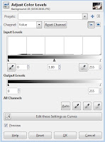
Another photo taken in my backyard. This one is clearly overexposed. (The cicada was located in an area shaded by a nearby tree. The wind kept moving the tree's branches and the spot would move out of the shade and into sunlight after the camera set the exposure.)
The light areas in this image have basically lost all details, also referred to as blown out highlights. The information needed to render these areas as anything other than a single color has been lost unless the camera saved the image in RAW format. Saved in any other format the image is a lost cause. (RAW files save more than 8 bytes of information per pixel, but only 8 bytes can be used when the image is displayed or exported in another format.)
A flat histogram with only a single peak at the far right is probably a badly overexposed image, but there are properly exposed images that would have similar histograms. This is why you can never really tell whether an image is overexposed, underexposed or properly exposed without actually looking at the image.
Example #3 (Deep Shadows, Bright Highlights)

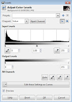
A visual inspection of this photo might result in the conclusion that there is no reason trying to save it. It looks as if information might have been lost in the dark parts of the image (clipped shadows). Examining the histogram shows that the range actually does not go all the way into true black. This means that there has been no information lost at the dark end of the value scale. At the same time, there is only a small peak at the right end which corresponds to the highlights on the cicada's wings.
Some hard work could transform this image into one that is far more visually appealing. The standard tools may not be adequate when trying to save this type of image, though. (Editing levels as curves my work, but that is far more complicated than other editing methods.)
This one isn't a complete lost cause, but may not be worth the effort it would take to save.
Again, a perfectly usable image could produce a similar histogram. (Think black car with tinted windows and a few chrome highlights.)
Example #4 (Peak at 0)

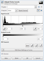
I had to dig into my personal archives to find an example with a peak on the left side. This one dates to 2008 and combines a peak one both ends of the spectrum. The dynamic range was just too broad to capture without using a RAW file.
The lower right part of the image contains no usable information and is just solid black. This image is similar to the first example in that the underexposure is due to the value range being more than the camera could handle. The result is a portion of the image being underexposed instead of the entire image.
These types of images may still be usable, but the over or under exposed areas need to be considered when editing.
I don't have an example of an underexposed image . The histogram would look similar to the overexposed image in example #2, but reversed with the peak on the left side.
The histogram for every image is going to be as unique as that image. The ones above are just meant to give brief illustration about the type of histograms that might be encountered and what to be on the look out for.
A histogram is a statistical tool used to display the distribution of a range of data. An image histogram displays the tonal range of the individual pixels that comprise the image. Each pixel is given a value ranging from 0 to 255 depending on its tone (brightness). A value of 0 corresponds with black, 255 with white and 128 is a mid-tone in between those two values.
Why 0 to 255?
That is the amount of information that can be stored in a single byte of information. A byte is eight bits. A bit can hold two numbers: 0 or 1 (or two pieces of information.) Adding a bit allows you to double the amount of information that can be held. Eight bits is 28 (or 2 doubled eight times) of information that can be stored. In numerical terms, that is 256 different combinations possible. 0 to 255 equals 256 different numbers.
Color Channels
The software used to edit digital images will also display a histogram for the image's color channels: red, green and blue.
This has to do with the way images are displayed on a computer screen. Each of the screen's pixels produces actually produces those three colors of light in varying strengths. The color perceived by the human eye depends on the amount of each color produced. A byte of information is dedicated to each color. So the range of values for each color again ranges from 0 to 255.
Combining the 256 combinations for each color results in 16,777,216 potential combinations. This is the number of colors the modern computer monitor is capable of displaying.
What Histograms are Good For
All this means that histograms provide important information about the tonal range of an image. This includes vital information of the tonal range of each color channel as well as the image's overall range. This information can prove very useful when it comes to editing the image. The histogram can even be directly edited. (This is usually referred to as editing an image's levels. Look for your software's level editing options to alter the histogram.)
Many digital camera include an option to view the histogram for an image before you actually hit the shutter release. This immediate feedback can help at times. A histogram that is pushed against either side indicates that exposure adjustment may be in order.
The rest of this post is dedicated to providing histogram examples and the conclusions that can be reached by examining them. Editing histograms will be covered in a future post.
Example #1 (Peak at 255 Mark)


Any attempt to increase the contrast in this image needs to be done carefully. Increasing contrast in this case runs the risk of pushing the non-white pixels in the flowers into being white, losing definition in the flowers.
There is also very little room to extend contrast on the dark end for this image. While there is no actual black, there is a small peak just shy of that value. Increasing contrast could also lose details in the dark areas of this image.
A peak at the 255 mark is often associated with overexposure. This does not necessarily require the entire photo to be overexposed. It may be a portion of the image that is overexposed (the flowers above fall in that category). Digital camera aren't always capable of covering the entire range of values present when a photo is taken. This results in either the bright areas being overexposed or the dark areas being underexposed.
Example #2 (Overexposed Image)


The light areas in this image have basically lost all details, also referred to as blown out highlights. The information needed to render these areas as anything other than a single color has been lost unless the camera saved the image in RAW format. Saved in any other format the image is a lost cause. (RAW files save more than 8 bytes of information per pixel, but only 8 bytes can be used when the image is displayed or exported in another format.)
A flat histogram with only a single peak at the far right is probably a badly overexposed image, but there are properly exposed images that would have similar histograms. This is why you can never really tell whether an image is overexposed, underexposed or properly exposed without actually looking at the image.
Example #3 (Deep Shadows, Bright Highlights)


Some hard work could transform this image into one that is far more visually appealing. The standard tools may not be adequate when trying to save this type of image, though. (Editing levels as curves my work, but that is far more complicated than other editing methods.)
This one isn't a complete lost cause, but may not be worth the effort it would take to save.
Again, a perfectly usable image could produce a similar histogram. (Think black car with tinted windows and a few chrome highlights.)
Example #4 (Peak at 0)


The lower right part of the image contains no usable information and is just solid black. This image is similar to the first example in that the underexposure is due to the value range being more than the camera could handle. The result is a portion of the image being underexposed instead of the entire image.
These types of images may still be usable, but the over or under exposed areas need to be considered when editing.
I don't have an example of an underexposed image . The histogram would look similar to the overexposed image in example #2, but reversed with the peak on the left side.
The histogram for every image is going to be as unique as that image. The ones above are just meant to give brief illustration about the type of histograms that might be encountered and what to be on the look out for.
Subscribe to:
Posts (Atom)